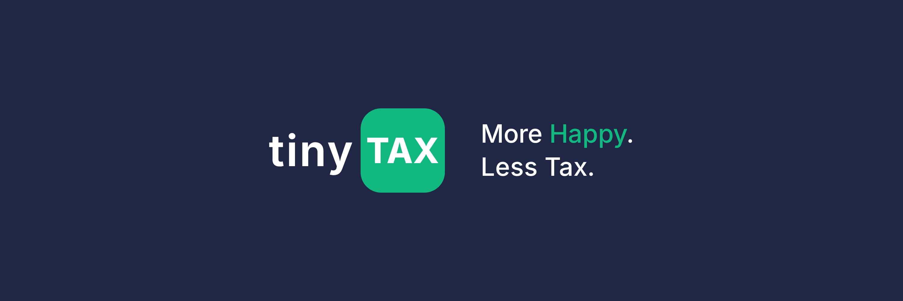
TinyTax Brand
More Happy. Tiny Tax.
Brand Foundation
Personality
TinyTax should feel like a knowledgeable friend who happens to be great with taxes — not a stuffy accountant, not a faceless corporation.
- Optimistic but grounded
- Capable but approachable
- Warm but professional
Voice in UI
"You're all set!"
"Let's review this together"
"Nice! That's done."
"You are all set."
"Review your information"
"Form submitted."
Colour System
Our palette balances professionalism with optimism and warmth.
Navy
#1f2744
Trust, stability, professionalism
Green
#11B981
Growth, success, optimism
Coral
#F97066
Marketing illustrations only — avoid in UI
Growth, money, fresh starts. Our hero colour for actions and success.
Trust, professionalism, stability. Grounds the brand with confidence.
Reserved for marketing illustrations and graphics. Avoid in UI — red tones can signal errors.
Warmer grays feel more human and approachable than cool grays.
Semantic Colours
Softer, friendlier variants that align with our "happier" brand.
Success
"Great job!" not "Transaction approved."#ECFDF5
#11B981
#047857
Warning
"Just so you know..." not "WARNING!"#FFFBEB
#F59E0B
#B45309
Error
"Let's fix this together" not "ERROR!"#FEF2F2
#E57373
#C62828
Info
"Here's a tip..." not "NOTICE:"#EFF6FF
#60A5FA
#2563EB
Draft
"Still working on this..." not "INCOMPLETE"#E0E7FF
#8B5CF6
#3730A3
Typography
Inter
Get from Google Fonts48px / 700
36px / 700
30px / 600
24px / 600
20px / 600
16px / 400
14px / 400
Logo System
Use the appropriate variant for your background. Maintain clear space equal to the height of the "t" in tiny.
Minimum Size
Digital: 100px width
Print: 25mm width
Clear Space
Minimum padding equal to the height of lowercase "t" (~36px at full size)
Downloads
All brand assets in one place. PNG and print-ready formats.
Logos
Social Media
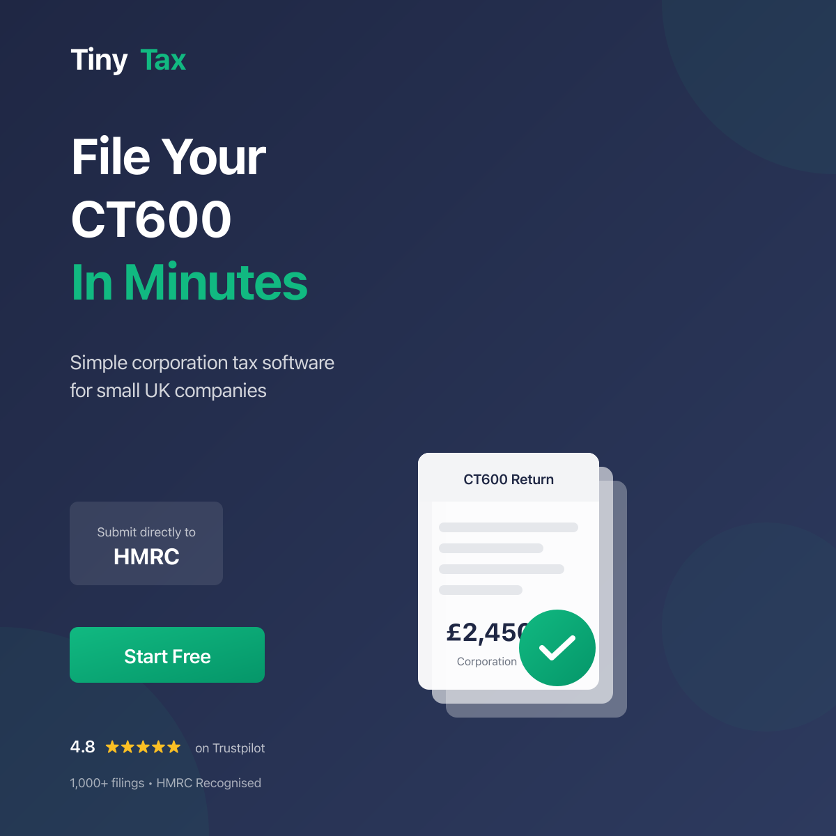
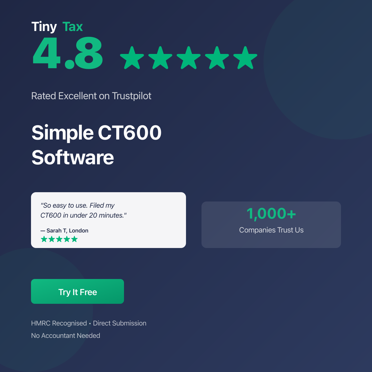
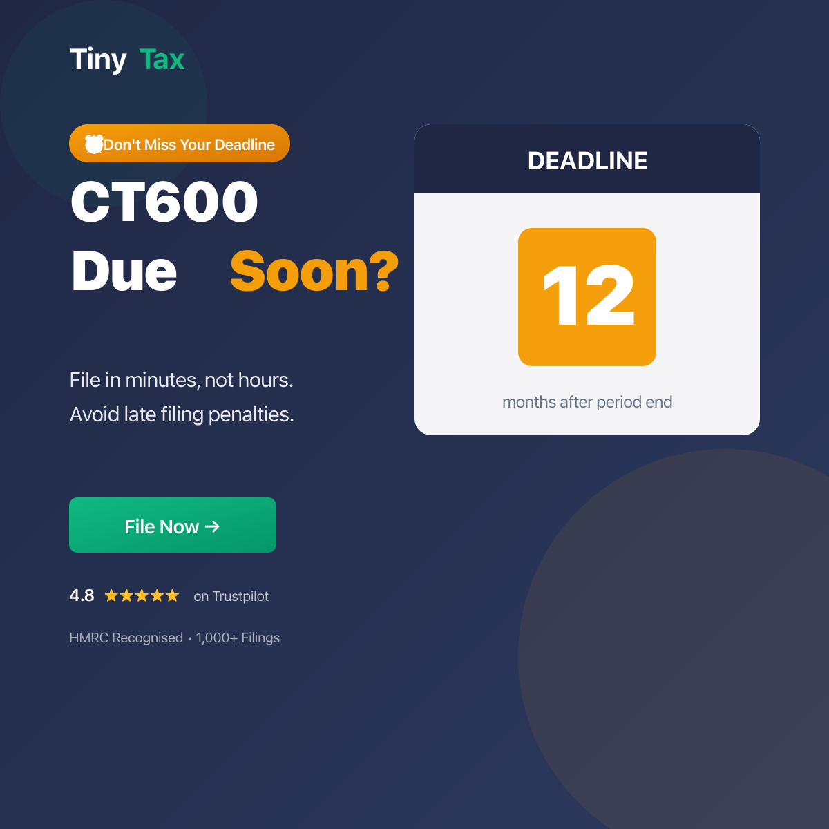
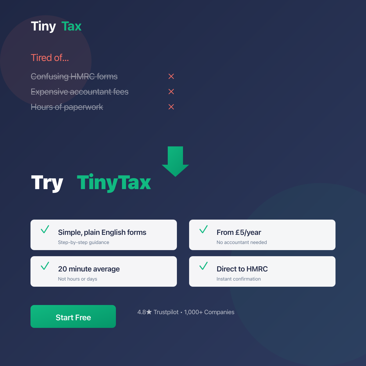
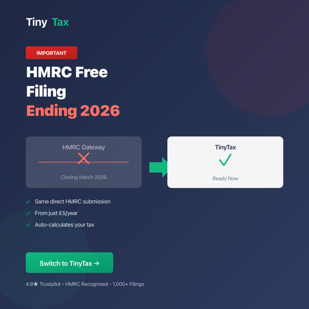
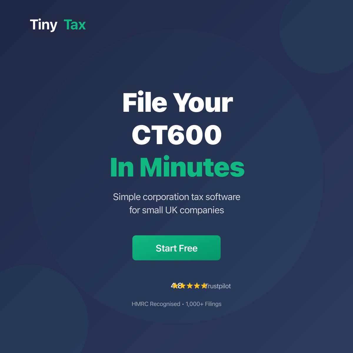
Google Ads - Responsive
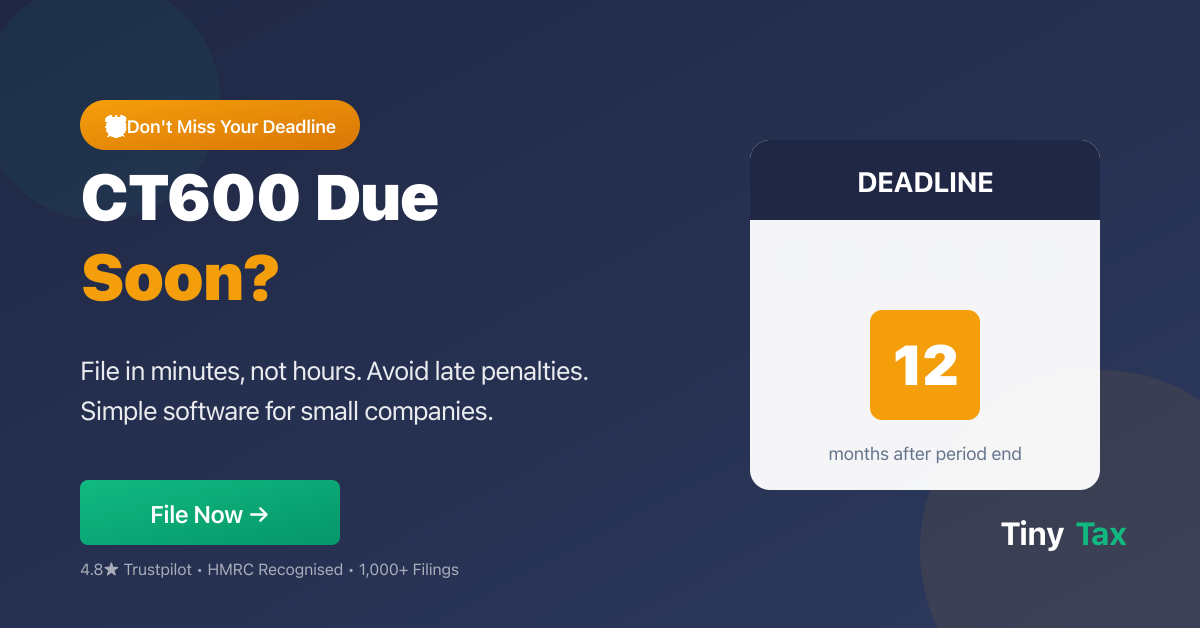
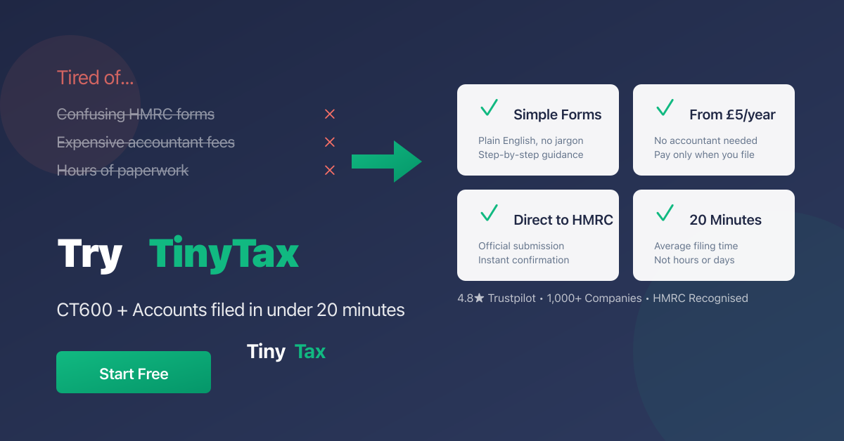
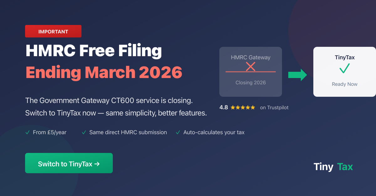
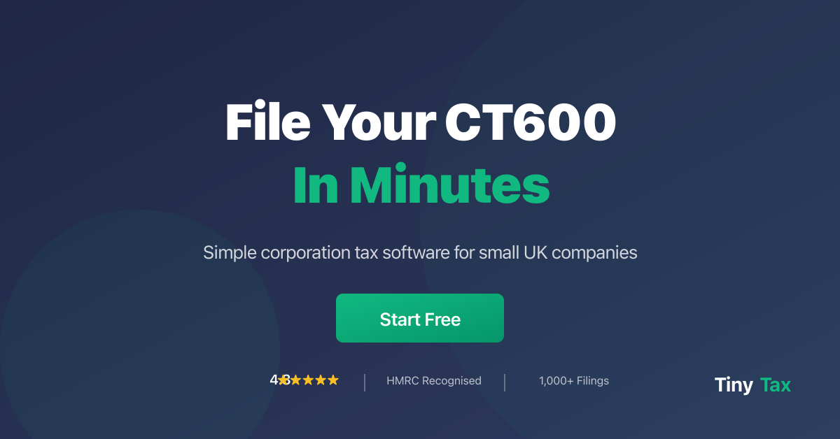
Upload 5-10 images per size for best performance. Each theme has landscape (1200×628) and square (1200×1200) versions.
UI System
Live examples of UI components, patterns, and interactions using the TinyTax design system.
Buttons
Alerts
Cards
Standard Card
Used for grouping related content with subtle elevation.
You did it!
Your CT600 has been filed successfully.
Form Elements
Badges
Status Badges
Interactive status indicators for filing states. Clickable badges have a subtle scale animation on hover.
--success-bg, --success-dark
--warning-bg, --warning-dark
--error-bg, --error-dark
--draft-light, --draft-dark
--warning-bg, --warning
--warm-100, --warm-500
Links
Inline text with a standard link that users can follow.
Use muted links for secondary navigation or less important actions.
External links open in new tabs: External site
Modals
Confirm Action
Are you sure you want to proceed? This action cannot be undone.
Icons
We use inline SVG icons for flexibility and performance. Standard size is 20×20px with 2px stroke width.
16px
20px (default)
24px
32px
Tables
| Period | Status | Amount |
|---|---|---|
| 2023-2024 | Filed | £1,250.00 |
| 2024-2025 | Pending | £1,875.50 |
| 2025-2026 | Draft | — |
Focus States
All interactive elements must have visible focus indicators for keyboard navigation and accessibility.
Loading States
Skeleton loaders for content placeholders:
Animations & Transitions
Consistent motion creates a polished, professional feel. Keep animations subtle and purposeful.
transform: translateY(-2px)
box-shadow: increase
opacity: 0 → 1
duration: 0.2s
transform: scale(0.95 → 1)
ease: ease-out